Decorating and accessorising: it’s hard to know where to start, especially if you’ve not got an eye for design – and what works best with what. With Dulux revealing Rhythm of Blues as its much-anticipated colour of the year, it’s all too tempting to just rush out and grab some tins of paint and get to work. But it’s not just blue, blue and yet more blue, as the last thing you want it sensory overdrive. Read on for essential advice from four interior experts on how best to incorporate this hue into your home.
RULE 1
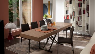
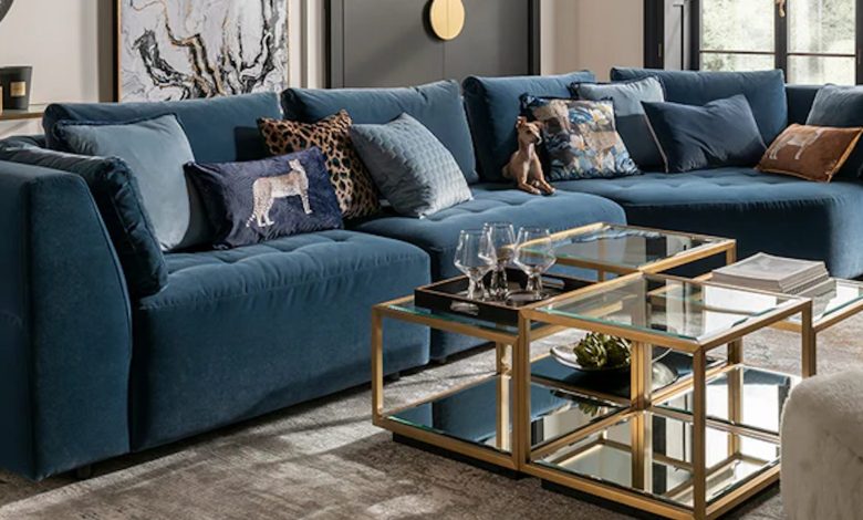
“Complement blues with metallic accents,” says Lucy Mather, interiors expert at home furnishing store Arighi Bianchi. “Rich and velvety, Dulux’s Slow Swing makes the perfect backdrop for a living space. Used across panelling or on a feature wall, it creates intimacy, especially when paired with tactile textures and accents in chrome, brass or gold. The key’s in the layering: think velvet sofas, bouclé cushions and wool throws, with ambient lighting to soften the colour’s depth. Or, for a more playful take, a corner sofa in a striking mid-blue, paired with warm wood floors and a textured rug, instantly energises the room. Let the blue sing, but balance with neutrals so it feels inviting rather than overwhelming.”
RULE 2
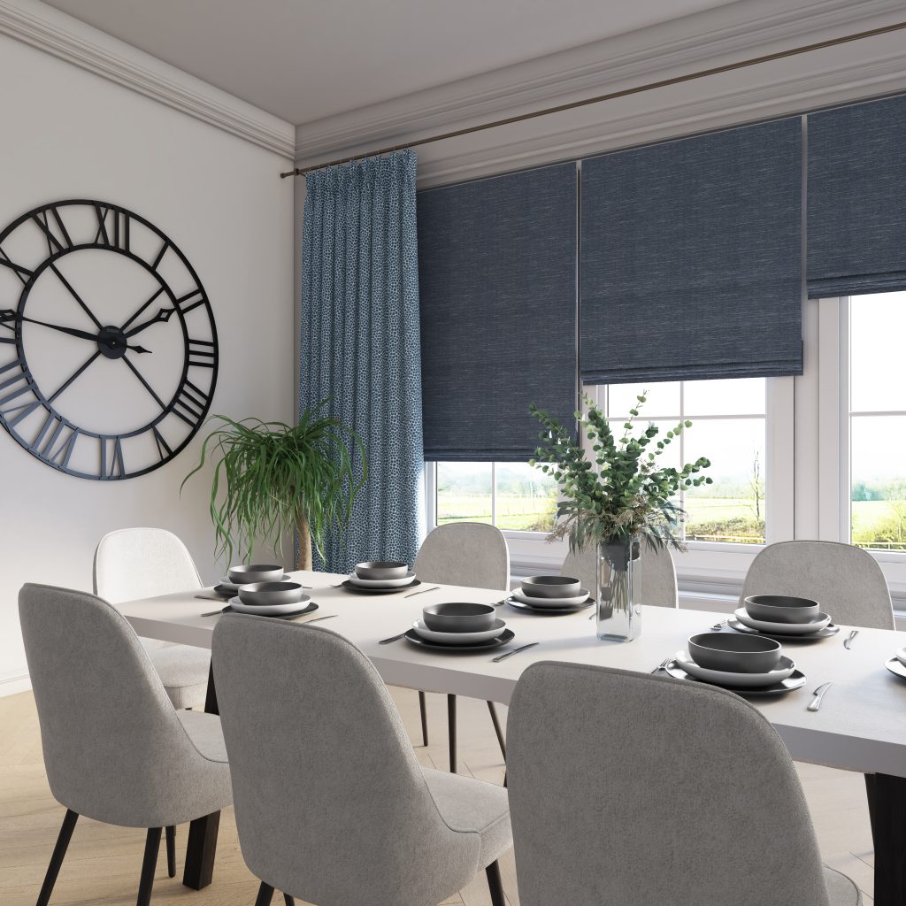
“Window dressings are an easy way to weave this trend into a room,” says Matt Thomas at Apollo Blinds. “Colour drenching in blue can be achieved by adding full length curtains against a dark blue wall to give an on-trend look. Add a roller blind in bright blue to create a contrasting striking feature against neutral walls, or, for a more luxurious finish, inky blue Roman blinds, combined with warm bronze or rust curtains, deliver real drama – perfect for formal living spaces or moody bedrooms. Just remember that lighter walls and warm accents prevent the shade from feeling too heavy, or go tonal with matching walls and blinds for a seamless, cocooning vibe. Blue blinds aren’t just practical – they change the whole mood of a room.”
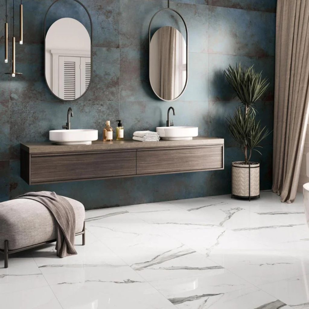
RULE 3
“Blue gives an unexpected wow factor for floors,” says Ashif Kazee, Tile Trends Expert at ROCCIA. “Used well, blue tiles have the power to anchor a space, creating depth underfoot while introducing subtle layers of texture and pattern. A tile finish that catches the light adds movement and an almost organic quality that softens what could otherwise be a hard surface. There’s so much choice, from watery ripples, marbled swirls or tonal variations, while the spectrum’s wide, too – from serene powder blues that bring calm, to dramatic navies that ground a room with authority. It also depends on the room, with light, mid-blue, or deep navy porcelain tiles creating spa-like bathrooms, while geometric patterned tiles deliver graphic drama, ideal for a utility room where you want character with a luxe edge.”
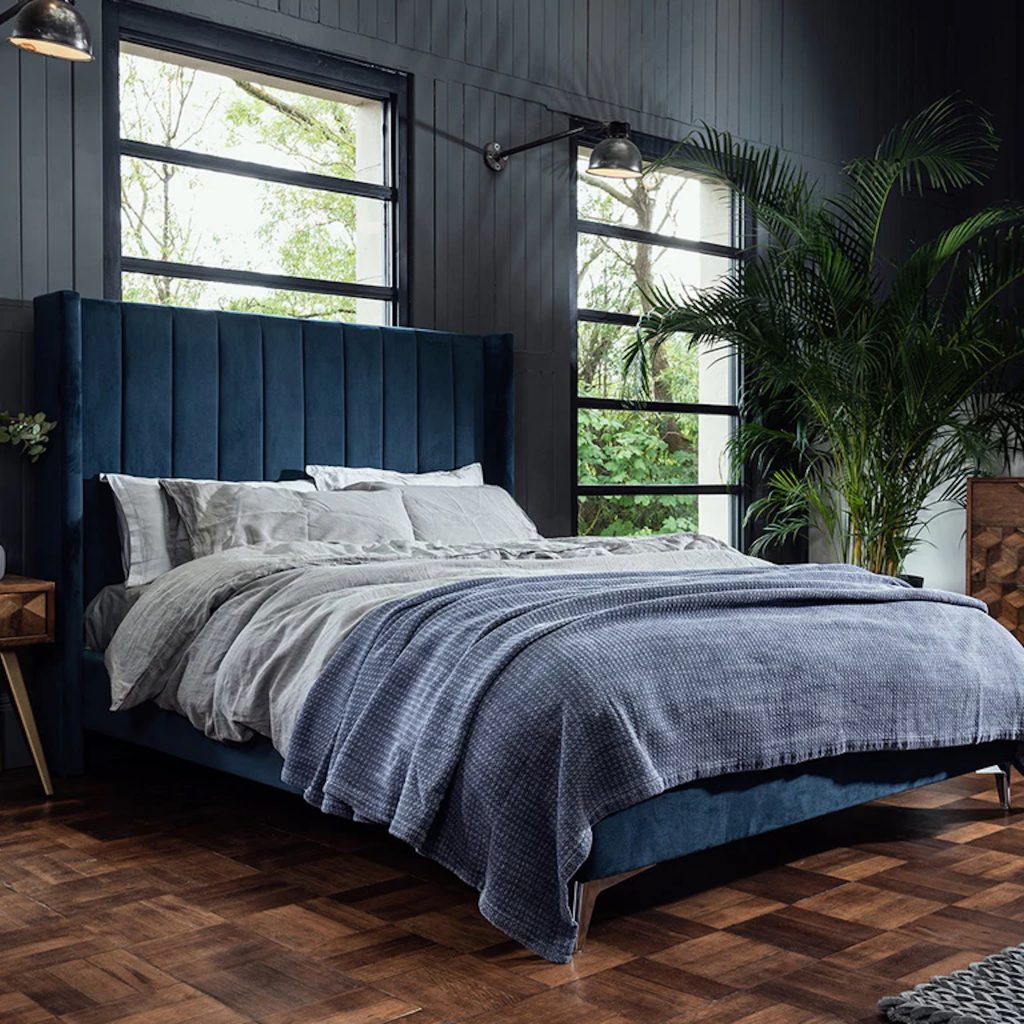
RULE 4
“Bedrooms should feel like sanctuaries, and Mellow Flow is the perfect shade to achieve it,” says Megan Baker, head of design at My Fitted Bedroom. “This light, sky-like quality softens a space and helps you unwind at the end of the day. Try using the colour for fitted wardrobes for a soothing backdrop, or add darker blue doors alongside Mellow Flow walls. Alternatively, for a moodier room with a more cocooning feel, Slow Swing works beautifully when softened with lush greenery and tactile rugs. And then there’s vibrant shades like Free Groove; a fantastic way to have fun with colour. Whether used on cabinetry, panelling or fitted storage, it instantly energises the space and injects a sense of fun without feeling overpowering.”